

Less "n" More
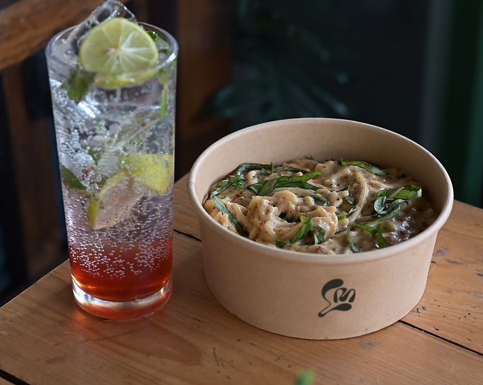
Less & More is a boutique eatery inspired by a chef’s journey through Europe. Rooted in authenticity and refined simplicity, it serves handcrafted pasta and gourmet burgers with bold European Italian flavors. The name reflects its philosophy: less clutter, more flavor.

Visual Identity
Less & More’s visual identity evokes sophistication and a European flair. A muted earthy green anchors the palette, symbolising quality and calm. Clean layouts, minimal graphics, and balanced typography reflect the brand’s refined, “less is more” philosophy intentional, stylish, and quietly confident.


The Logo
The Less & More logo features a custom “L” and “M” monogram, forming an organic shape that hints at herbs or pasta subtle nods to nature and cuisine. Elegant yet creative, the mark balances artistry with versatility, working seamlessly across signage, packaging, and digital platforms.
Brand Strategy
Our strategy translated the chef’s European expertise into a distinct local identity. We positioned Less & More as Nagpur’s chef-driven culinary outlier elevated yet approachable. Centered on signature pasta and burgers, the brand is clear, memorable, and rooted in story, making it stand out for both its flavors and its purpose.


Brand Application
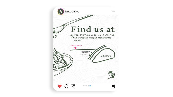
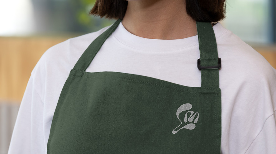
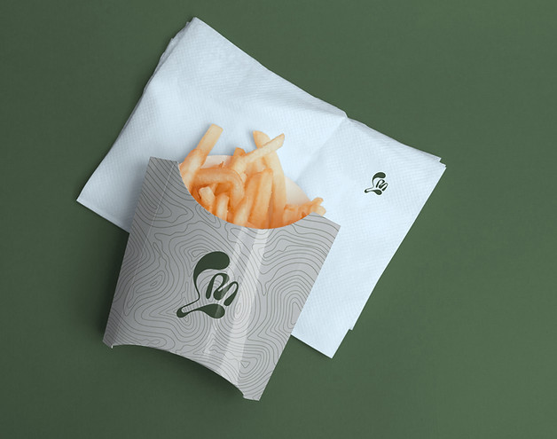
We extended the Less & More brand across physical and digital touchpoints for a cohesive experience. Thoughtfully designed packaging, modern uniforms, and elegant in-store branding reflect the brand’s premium yet minimal aesthetic. As it grows online, the identity remains scalable and consistent-built for beauty and longevity.
